Contrasting Communication Perspective can move us in different ways.
This next post only provides a small sample in Contrasting Communication Perspective with elements of Visual Literacy. Hopefully it’ll leave you with a better understanding in how visual imagery and art can convey communication wider than mere words. The elements provided above are just the tools we all use to compose context, organize our thoughts, and create some sort of order.
Knowing the tools of visual communication is one thing. Using them is another. This is where composition comes into play. And yes, there are techniques for those too.
A visual creator uses many strategies and variations to convey an idea. Just as in language literacy. Certain frames and structures can be used to build new things.
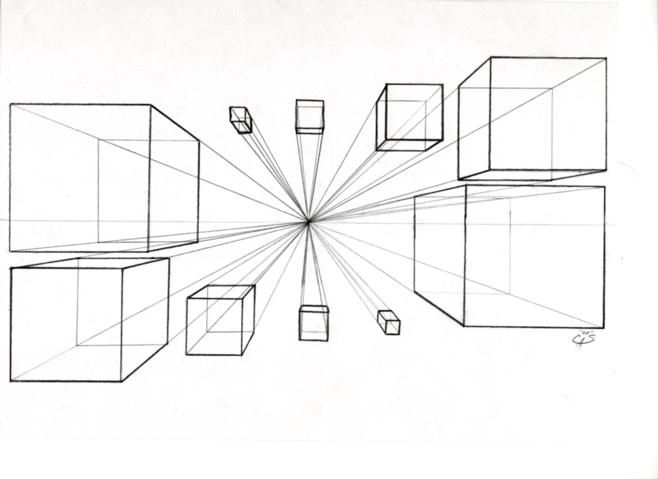
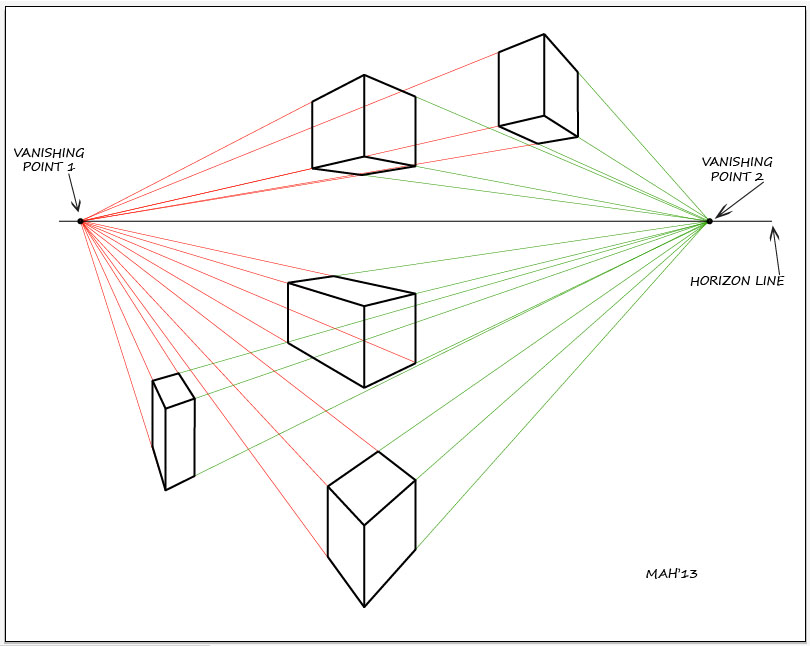
Using linear perspective is a way to create windows into another world.
The edges of the page is the window. Fixing the point of view at eye level is the very first thing. The horizon line can be near the top, bottom or middle. A choice of one, two, or more perspective points can made after. These are the parallel lines that converge on a vanishing point on the horizon.
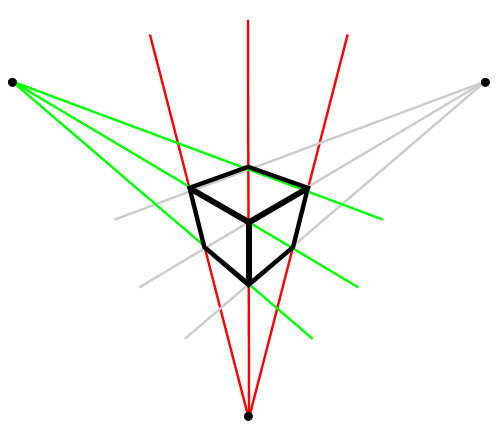
The lenses in the world now include our own personal viewfinders.
Snap Chatting back forth with many tweets and a variety of faces.
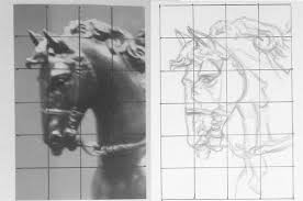
Creating a big picture in Contrasting Communication Perspective! Composing is the task of organizing an art object and creating order. One of the main ways of is the Grid method.
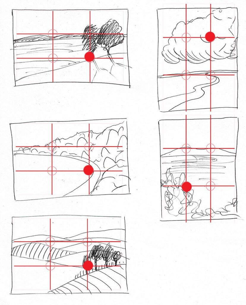
Another way is the Rule of Thirds.
As in music theory to the ear this provides a sense of harmony to the eye. The key features are at the intersections. You may notice these lines in your camera view finder.
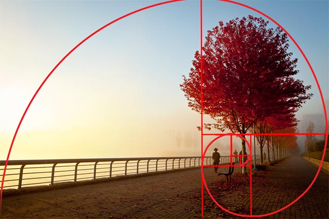
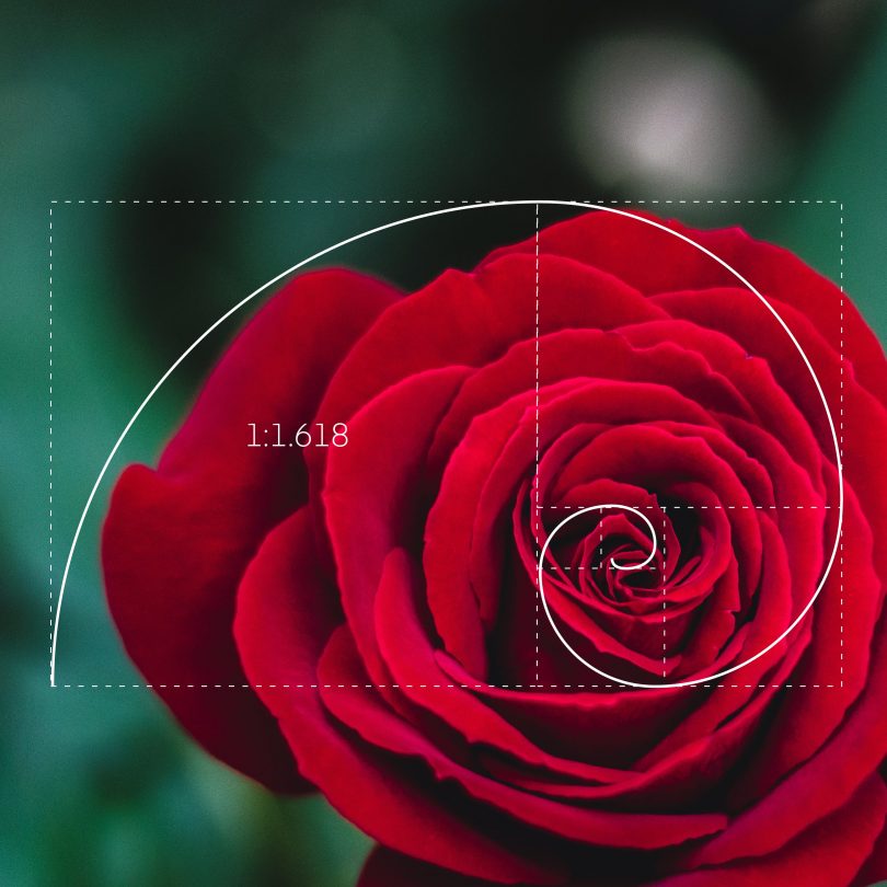
Or even the Golden Ratio method.
This describes a perfectly symmetrical relationship between two proportions.
Then we have the Rule of Odds.
This just states that odd numbers are better in compositions than even numbers.


These examples are by no means the end all be all in composition and design. All this also includes breaking the rules at some point. It’s important to know Why the Rules Can Be Broken though. The variations are endless and your choices in elements are boundless. Using these basic skills in practice will help anyone in their visual literacy. Try using your camera to frame your own photography with the above examples. You’ll see a marked improvement on your picture taking skills.
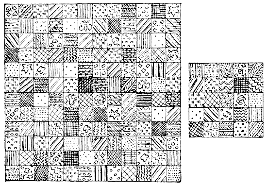
Unity is key when using the grid methods. The proportions are equal in their bearing with a powerful sense of cohesion and stability. This also provides repetition. Which is a powerful way to convey any idea. Rinse and Repeat is the motto. :chuckle:
Continuity is another aspect. This implies connections between forms giving it a sense of fluidity. Finally creating a boundary or frame around a composition can unify them all into one object.
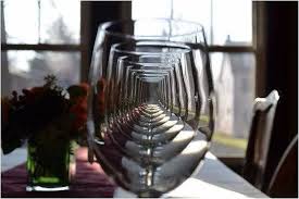
Variety is the contrast to Unity.
There are really no rules just guidelines…
Remember…
It’s important to know Why the Rules Can Be Broken! Your compositions will make more sense if you do…just be prepared for strong critique.
Placing forms in the center of a composition draws our eye towards a point. Isolating forms and colors to draw the viewers eye in. Creating contrasts between two or more elements is another aspect to draw on for the story line.
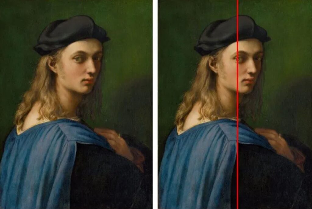
Or you can democratize each item by giving them all equal value until nothing stands out or overpowers the composition. Such as a repeated pattern to form a texture or de-emphasizing color and value by using more greys than usual. Nothing really stands out except the whole.
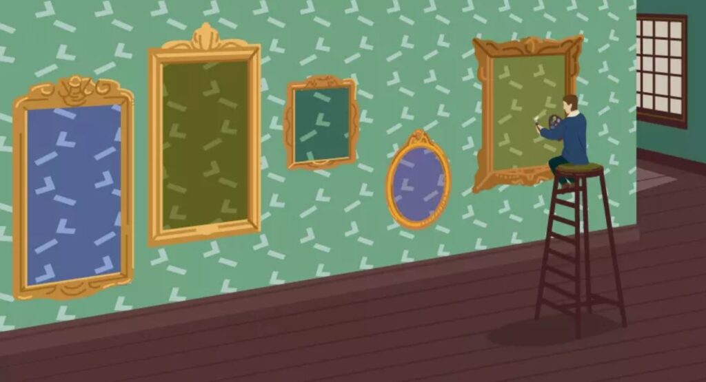
Contrasting Communication Perspective and Balance
Tools for proportion and scale
– Proportional divider
– Pantograph
– Grid
– Viewfinder
– Proportional scale
– projector
– Copier machine, Photoshop, other tools.
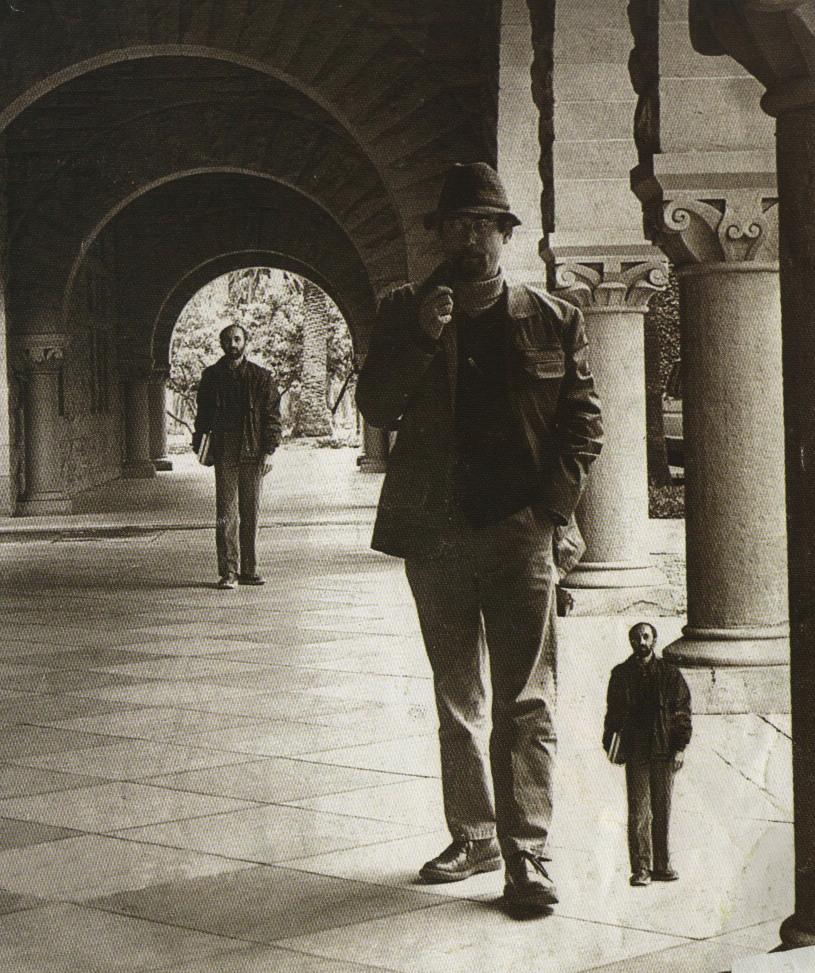
Try this for an experiment in scale. Take some of your favorite snapshots or images and shrink them down to one inch by one inch. Icon or avatar size! How well does the composition show through? Certain amounts of information will be lost in the reduction. What parts should stand out more?
10 Intriguing Photographs to Teach Close Reading and Visual Thinking Skills
Closely reading any text, whether written or visual, requires that students proceed more slowly and methodically, noticing details, making connections and asking questions. This takes practice. But it certainly helps when students want to read the text.
We’ve selected 10 photos from The Times that we’ve used previously in our weekly “What’s Going On in This Picture?” and that have already successfully caught students’ and teachers’ attention. These are some of our most popular images — ones that may make viewers say “huh?” on first glance, but that spark enough curiosity to make them want to dig deeper. (Please Note: You can quickly learn the backstory about any of these photos by clicking the link in each caption that takes you to the original post, then scrolling down to find the “reveal.”)
Consider the value of time itself.
What is the creation time in an art work? How much aesthetic, in the moment feeling went into the work itself? How many stories can be told with one scene? Do you like linear stories, or stories told with a narrator and character, or stories telling the view of many sources?
Time, motion, and rhythm can always unlock alternative versions to a reality. Time is the indefinite continued progress of existence and events of past, present, and future regarded as a whole.
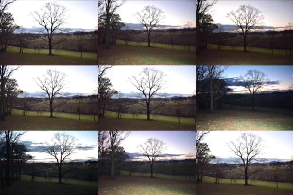
A snapshot is a fixed moment in time and space. If you take more than one snapshot of an object at different times of the day a movement in time occurs as a visual reference. Each photo is relative to the one next to it. The movement is controlled, the light has changed, etc.

Now add more frames to the subject. Cut them up into squares and you can set the rhythm and motion at random. Allow the temporal shift and watch the time move. Just like the clouds convey change at every breath of the wind.
People define points in time in many ways. A fixed number on the clock, the sunlight direction, or even the stars in the sky can define our time. This is why creation time is important in value.
What makes a creation more valuable?
The time spent in making it ? Or a mass produced shiny object.
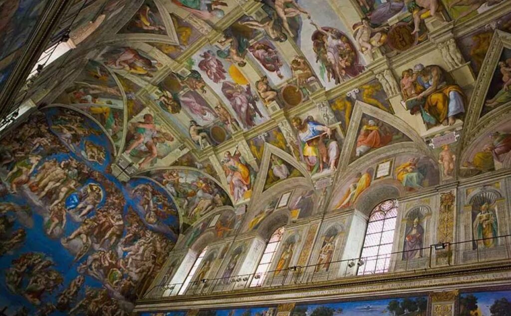
Then there is the time it takes for viewer to take it all in to consider. The duration of the experience is determined by the viewer. Each element can be explored…
Think of it like putting on your fine clothes as opposed to your more comfortable ones. Puttin’ on the Ritz takes a bit more time. Even when you cook something: A fine meal takes consideration, planning, and time to prepare. Contrast that with a TV dinner in the microwave.
The space is fixed but the movement is yours to consider:
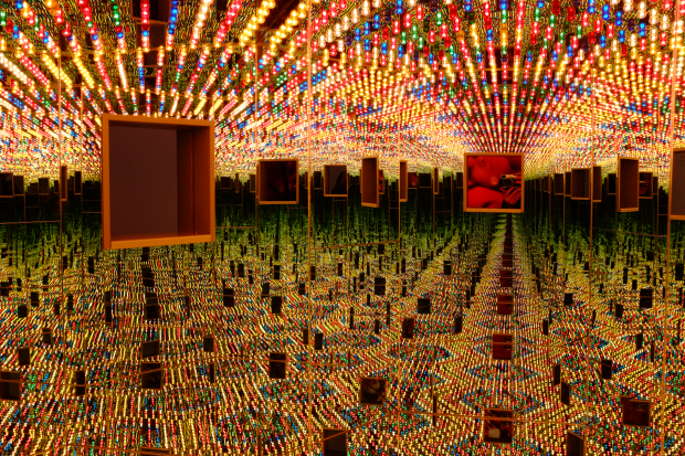
Contrast this with the movement in films.
You, as the viewer, have less control of where your eye goes. Print design offers more control for the viewer to take the time in their observations.
Framing and sequencing denote the progress of time. Comics and cartoons are a great way to show this.
